The Hidden Language of Your Walls
Marcus sat at his desk on a Tuesday afternoon and noticed something unsettling. His team, usually a vibrant group of problem solvers, looked physically drained. The walls of the office were a standard corporate beige. The lighting was the typical fluorescent hum found in thousands of buildings across the country. He started to wonder if the environment itself was draining the collective battery of his staff. Could the very room they worked in be a silent thief of productivity and morale?
As managers, we often focus on workflows, software, and key performance indicators. We spend hours refining our communication styles and looking for the next strategic advantage. Yet, we frequently overlook the literal atmosphere in which our teams operate. The science of color psychology suggests that the visual stimuli surrounding us are not just aesthetic choices. They are neurological triggers that affect the endocrine system and cognitive function.
The Biological Response to Visual Stimuli
When light enters the human eye, it travels to the hypothalamus. This is the part of the brain responsible for releasing hormones and regulating body temperature, sleep, and appetite. Different wavelengths of light correspond to different colors. These wavelengths trigger distinct chemical reactions in our bodies. This is not about personal preference or interior design trends. It is about human biology.
Research has shown that certain colors can either stimulate or suppress the production of melatonin and cortisol. If your office is dominated by colors that induce a low-level stress response, your team will experience fatigue faster. Conversely, if the environment supports the specific type of work being done, the brain can maintain focus with less effort. This raises an important question for any leader. Are you unintentionally making it harder for your people to do their jobs?
The Calming Precision of Blue and Green
For tasks that require high levels of concentration and cognitive endurance, blue is frequently cited as the most effective choice. A study from the University of British Columbia found that blue environments helped participants perform better on tasks requiring creative thinking. It provides a sense of calm and stability. This is why many high-stress control rooms or medical facilities lean into cooler tones.
Green carries a different but equally vital weight. It is the color of nature and growth. According to Attention Restoration Theory, looking at green or being in a green-heavy environment helps the brain recover from mental exhaustion. This is often referred to as biophilia. If your team is struggling with burnout or feels disconnected from the purpose of their work, incorporating green can act as a subconscious reset.
- Blue promotes communication and trust among team members.
- Green reduces eye strain during long periods of computer use.
- Both colors are perceived as professional and reliable without being sterile.
The Intensity of Red and Yellow
There are times when a team needs a surge of energy rather than a blanket of calm. This is where the warmer end of the spectrum comes into play. Red is known to increase the heart rate and blood flow. It is a physical stimulant. In a workspace, this can be a double-edged sword. While it might help with tasks that require physical exertion or immediate attention to detail, it can also increase anxiety levels.
Yellow is often associated with optimism and energy. It triggers the release of serotonin. However, excessive use of bright yellow can lead to frustration and eye fatigue. It is a color that works best in small doses or in collaborative spaces like breakrooms or brainstorming zones. The challenge for a manager is finding the balance. You want a team that is energized but not agitated.
Transitioning to the Digital Workspace
In our modern era, many teams do not share a physical office. The workspace has shifted to a grid of boxes on a screen. This does not mean color psychology is no longer relevant. In fact, it might be more important than ever. The digital backgrounds we choose and the interfaces we use contribute to what is now known as Zoom fatigue.
If you are leading a remote team, consider the visual impact of your video calls. A cluttered or harsh background can be distracting. A background with soft blue or neutral tones can help your team focus on your words rather than the visual noise behind you. It is a subtle way to show you care about their cognitive load.
- Suggest neutral or soft-toned backgrounds for long meetings.
- Use color-coded digital folders to help teams organize tasks intuitively.
- Encourage remote staff to place a plant or a piece of art in their line of sight.
Implementation Without Overhaul
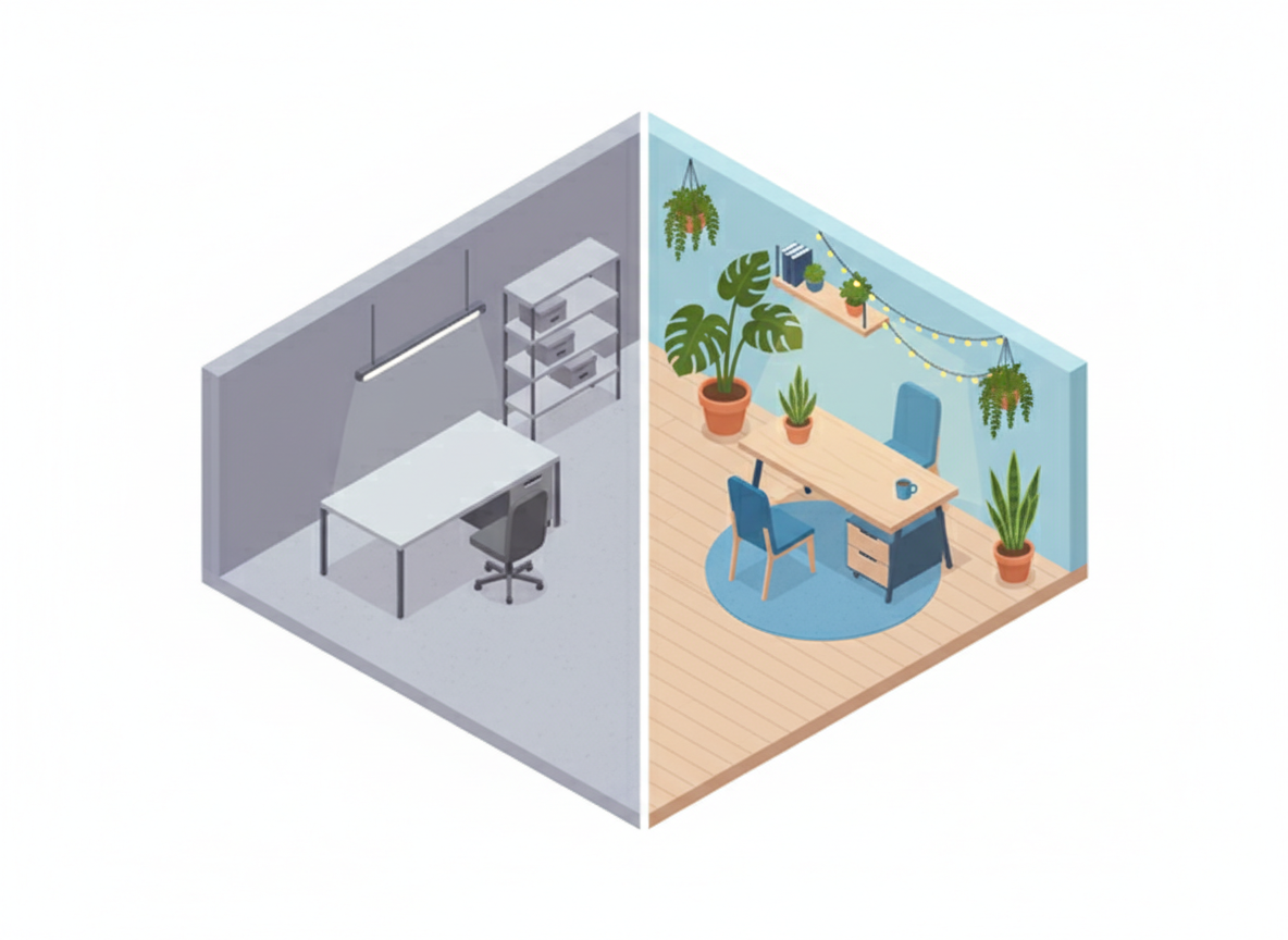
You do not need a massive renovation budget to apply these insights. Small, intentional changes often yield the most sustainable results. If your office feels cold and uninspiring, adding a few blue desk lamps or green indoor plants can shift the mood significantly. These are signals to your team that you are invested in their well-being.
Start by observing the areas where your team congregates. Is the breakroom too bright? Is the focus area too drab? Ask your team how they feel in different parts of the building. You might find that their struggles with certain projects correlate with the environments in which they are working on them.
Managers who understand the psychological impact of their environment are better equipped to support their teams. By making data-driven decisions about the colors and layouts of our workspaces, we provide a foundation where people can actually thrive. It is not just about paint. It is about creating a space where the work feels possible again.