What is a Burndown Chart?
The weight of a deadline can feel heavy when you are responsible for a team. You care about your business and you want to see your people succeed, but the uncertainty of a project’s timeline often leads to sleepless nights. You might wonder if you are actually on track or if you are simply hoping for the best. This is where a burndown chart becomes a vital tool for your management toolkit. It is a simple graphical representation that shows how much work is left to do versus the time you have remaining. Unlike complex reports that hide the truth in spreadsheets, this chart provides a clear visual of your path forward.
At its core, this tool tracks the effort required to complete a project. It does not focus on what has already happened in a celebratory way. Instead, it focuses on the reality of the remaining tasks. This focus on the remaining work is what helps a manager move from a state of worry to a state of informed action. When you see the work decreasing day by day, you gain the confidence to lead. When the line stays flat, you know exactly when to step in and offer support to your team.
The Mechanics of a Burndown Chart
A burndown chart consists of two main axes that tell the story of your project. The vertical axis represents the amount of work left to do. This could be measured in hours, task counts, or story points depending on how your team prefers to estimate. The horizontal axis represents time, usually broken down into days or weeks. To make the chart useful, a straight line is drawn from the starting point of total work to the end date of the project. This is often called the ideal work line.
- The vertical axis shows effort remaining.
- The horizontal axis shows the timeline.
- The ideal line represents a perfect, steady pace of work.
- The actual line shows the real-time progress of your team.
As your team completes tasks, the actual line drops. The goal is to keep that line as close to the ideal line as possible. If the actual line is above the ideal line, it suggests that the project is behind schedule. If it is below, your team is ahead of pace. This visualization allows you to see problems before they become disasters.
Reading the Burndown Chart Slope
The slope of the line provides deep insights into the health of your team’s workflow. A steep drop indicates a period of high productivity where many tasks were resolved quickly. A flat plateau indicates that work has stalled. This might happen because a team member is stuck on a difficult problem or because an external dependency is holding things up. As a manager, seeing a plateau is your cue to ask questions rather than wait for a status meeting.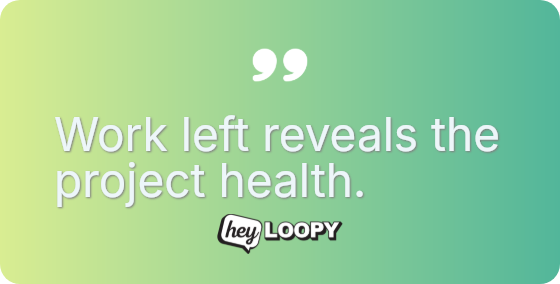
- A line above the ideal shows a need for resource adjustment.
- A line below the ideal shows a potential for early delivery.
- A jagged line reveals inconsistent workflow patterns.
There are questions we still do not fully understand about team dynamics through these charts. For example, why do some teams consistently start slow and finish fast? Is this a sign of poor estimation or a natural human rhythm of work? By observing these patterns over time, you can begin to understand the unique heartbeat of your specific organization.
Burndown Chart vs. Burnup Chart
It is common to confuse a burndown chart with a burnup chart, but they serve different psychological and practical purposes. A burndown chart is about the finish line. It shows how much more effort is required to reach zero work. This creates a sense of urgency and focus. It is particularly effective for short-term goals or specific sprints where the scope is fixed.
A burnup chart, on the other hand, tracks two lines: total work and completed work. This is useful when the scope of a project is constantly changing. If a client adds new requirements mid-project, the total work line moves up. In a burndown chart, scope creep can make it look like the team is making no progress because the line stays flat even as they work hard. Choosing between the two depends on whether you need to visualize the remaining effort or the total growth of the project scope.
Practical Scenarios for Your Team
You can use a burndown chart in several daily management scenarios to reduce stress and increase clarity. In a daily stand-up meeting, the chart serves as a focal point. It removes the need for long-winded updates and focuses the conversation on why the line moved or why it did not. This saves time and keeps the team focused on the most important tasks.
- Use it during sprint planning to set realistic goals.
- Apply it to client meetings to provide evidence-based updates.
- Leverage it to identify when a team is being overworked.
When a manager sees that the team is consistently above the ideal line, it is an opportunity to provide guidance. Perhaps the tasks were too complex, or perhaps the team needs more training. Instead of guessing why a project is late, you have a data-driven starting point for a conversation. This leads to a more supportive environment where the team feels seen and understood rather than just pressured to perform.