What is a Dashboard?
Running a business or managing a team often feels like piloting a plane through heavy fog. You know you are moving forward, but you are constantly worried about what you cannot see. You have spreadsheets for finances, a different platform for communication, and another system entirely for tracking how your employees are developing their skills. The anxiety comes not from a lack of data, but from a lack of cohesion. You have all the pieces, but they are scattered across a digital landscape that demands too much of your attention just to make sense of the basics.
This is where the concept of a dashboard becomes critical for your mental health and business health. It is not just a screen with pretty charts. It is a user interface designed to aggregate, organize, and present information in a way that allows for immediate comprehension. It is the tool that clears the fog so you can focus on flying the plane rather than fixing the instruments.
Understanding the Dashboard Function
At its core, a dashboard is a visual display of the most important information needed to achieve one or more objectives, consolidated and arranged on a single screen so the information can be monitored at a glance. For a busy manager, this means moving away from digging through rows of raw data and moving toward viewing synthesized insights.
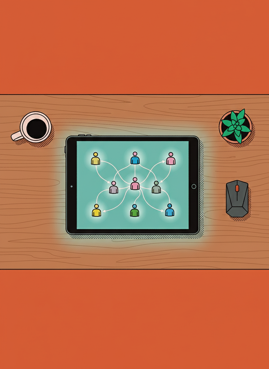
A well-constructed dashboard serves as a central nervous system for your operations. It connects to various data sources and translates that raw input into visual indicators. This might look like gauges, charts, or simple traffic light systems (red, yellow, green) that indicate status. The goal is to reduce the cognitive load on you. Instead of calculating how your team is performing, the interface presents the calculation so you can spend your energy deciding what to do about it.
Dashboard vs. Reporting
It is common to confuse a dashboard with a report, but understanding the difference is vital for how you manage your day. A report is a static document. It looks backward at what has already happened. It is usually detailed, long, and delivered periodically. Reports are excellent for deep dives and historical analysis, but they are not great for quick decision making.
A dashboard is dynamic and often near real-time. It monitors what is happening right now. While a report might tell you that training completion rates were low last quarter, a dashboard shows you that three specific team members are stuck on a module today. This allows you to intervene immediately rather than finding out months later when it is too late to help.

Visualizing Training Progress and KPIs
Two of the most common applications for management dashboards are tracking Key Performance Indicators (KPIs) and monitoring team development.
When we look at KPIs on a dashboard, we are looking for pulse checks. These are the vital signs of the business. You need to ask yourself what three or four metrics actually determine if you are winning or losing today. Placing these front and center ensures that you are never surprised by a sudden dip in revenue or productivity.
Regarding training progress, the dashboard becomes an empathy tool. It allows you to see where your team struggles. If you see that 90% of your staff has breezed through a safety course but stalled on a new software tutorial, the dashboard highlights a barrier. This is not just data. It is a signal that your team needs support, guidance, or better resources. It transforms you from a taskmaster into a supportive coach because you have the visibility to help them before they become frustrated.
Designing for Clarity and Focus
The scientific challenge with dashboards is avoiding clutter. There is a temptation to measure everything simply because we can. However, a dashboard with fifty metrics is just as useless as a blank screen because it creates analysis paralysis.
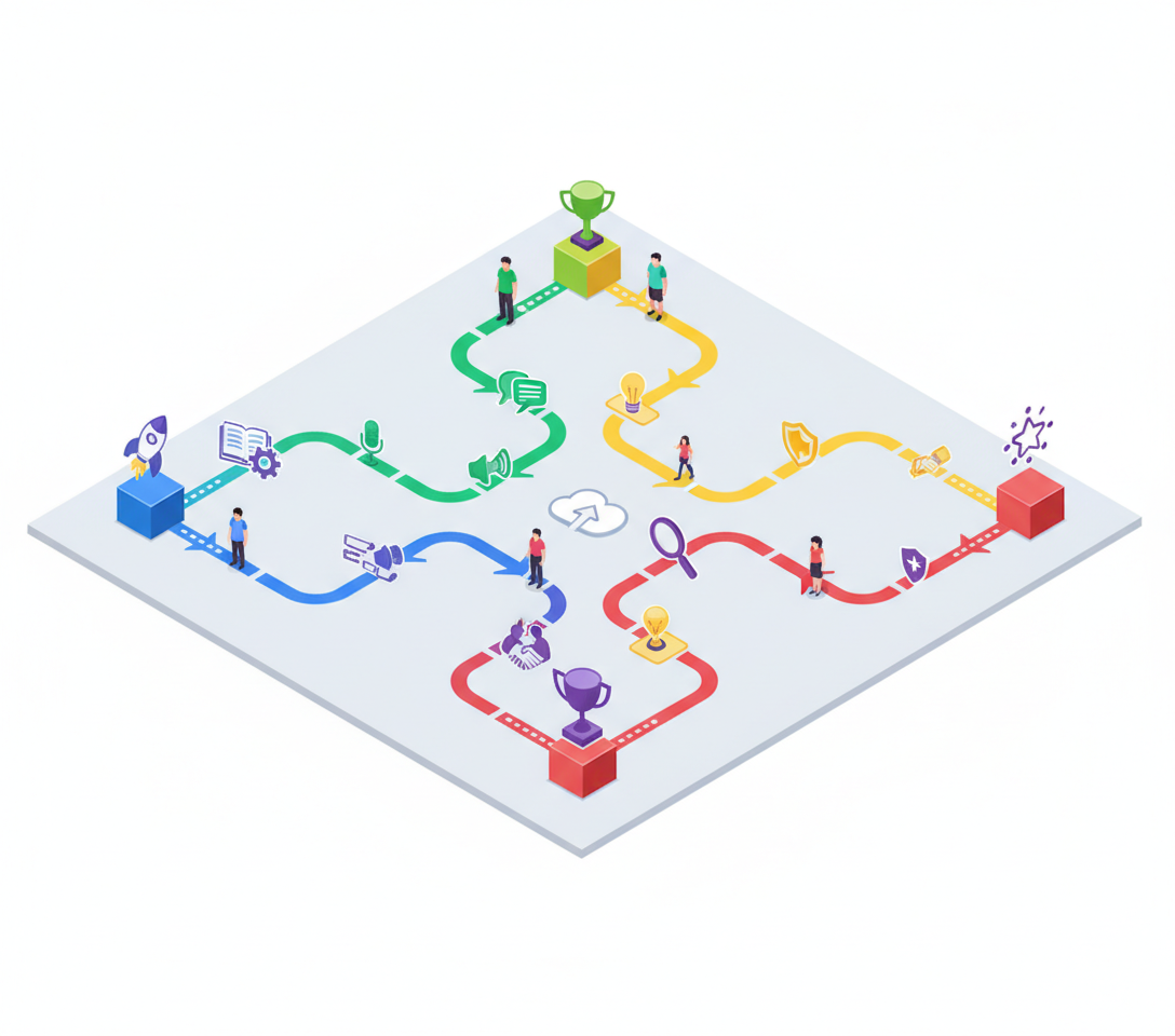
To use a dashboard effectively, you must curate it ruthlessly:
- Identify the top three problems you are trying to solve.
- Select metrics that directly correlate to those problems.
- Remove any metric that does not lead to a direct question or action.
By simplifying the interface, you create a space where you can think clearly. You remove the noise and focus on the signal. This is how you build a resilient business and a confident team.