What is a Gantt Chart?
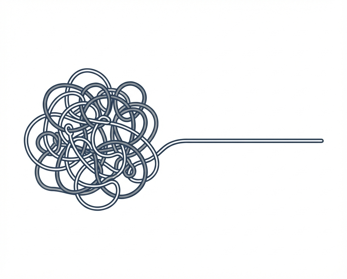
Managing a business often feels like walking through a heavy fog. You have a clear vision of where you want to go, but the daily tasks can obscure the path ahead. You worry about deadlines. You worry that your team is overwhelmed or, even worse, working on the wrong things. This uncertainty creates a unique kind of stress for a manager who cares deeply about their staff and the long term health of their company. To build something that lasts, you need tools that provide clarity without adding unnecessary complexity. One such tool is a visualization of work known as the Gantt chart.
Defining the Gantt Chart
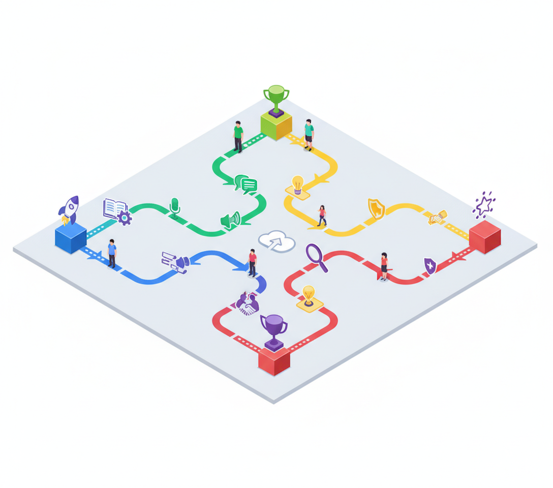
A Gantt chart is a specific type of bar chart that illustrates a project schedule. On a basic level, it shows you what work needs to be done and when it needs to be finished. The chart is structured with two axes. The vertical axis lists the tasks that make up a project, while the horizontal axis represents time. Each task is shown as a horizontal bar. The position and length of the bar reflect the start date, duration, and end date of that activity. This allows a manager to see at a glance how a project is laid out over weeks or months. It moves the project from a theoretical list in your head to a physical map on a screen or paper.
Understanding task dependencies
One of the most useful aspects of this tool is its ability to show dependencies. In any complex business venture, tasks rarely exist in isolation. Some things cannot start until others are finished. For example, you cannot paint a wall before the structure is built. In a Gantt chart, these relationships are often visualized with lines or arrows connecting the bars.
- Sequential dependencies show tasks that must happen in a specific order.
- Parallel tasks show work that can happen at the same time to save days.
- Milestones mark major turning points or achievements within the timeline.
By seeing these links, you can identify the critical path. This is the sequence of tasks that determines the shortest possible time to complete the project. If a task on the critical path is delayed, the entire project is delayed. Understanding this helps you focus your limited energy on the areas that matter most.
Gantt Chart vs Kanban Board
Many managers find themselves choosing between a Gantt chart and a Kanban board. While both are used to track work, they serve different mental models. A Kanban board focuses on the flow of individual tasks through stages like to do, doing, and done. It is excellent for continuous work or environments where priorities change daily.
A Gantt chart is different because it focuses on the schedule and the duration. Kanban is about the status of a task right now. The Gantt chart is about the plan for the future. If you need to manage a complex project with a fixed deadline, the chart is often the superior choice. If you are managing a steady stream of incoming requests, Kanban may be more appropriate. Many successful managers use both to get a complete picture of their operations.
When to use a Gantt Chart
You do not need a complex chart for every small task. However, when the complexity of a project grows, the mental load on a manager increases. You should consider using this tool in specific scenarios where the order of operations is vital.
- Launching a new product or service.
- Planning a major company event or conference.
- Managing a construction or office renovation project.
- Coordinating a marketing campaign with multiple contributors.
In these cases, the chart acts as a communication tool. It helps your team see how their individual contributions fit into the larger whole. It provides the clear guidance they need to work with confidence.
The unknowns of project visualization
While these charts are helpful, they are not perfect representations of reality. There are many things a bar on a chart cannot tell you. We still do not know how to perfectly account for the creative friction that occurs when humans collaborate. A chart assumes that if you allocate five days to a task, those five days will be productive. It does not account for employee burnout, personal emergencies, or the sudden shift in market conditions.
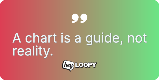
As a manager, you must ask yourself what the chart is hiding. Does the visual neatness of the bars give you a false sense of security? Does it cause you to ignore the emotional well being of the people doing the work? We must treat the chart as a living document that requires constant adjustment. It is a guide for the journey, but it is not the journey itself. By recognizing these unknowns, you can use the tool to provide structure while remaining flexible enough to support your team through the actual challenges of the work.