What is Responsive Design in eLearning?
You have likely spent countless hours agonizing over the training materials for your team. You worry about the content and whether the tone is right and if the information will actually help them do their jobs better. You finally launch the program, but the engagement numbers are low. You feel that familiar tightening in your chest. Did you miss the mark on the topic? Is the team just not interested?
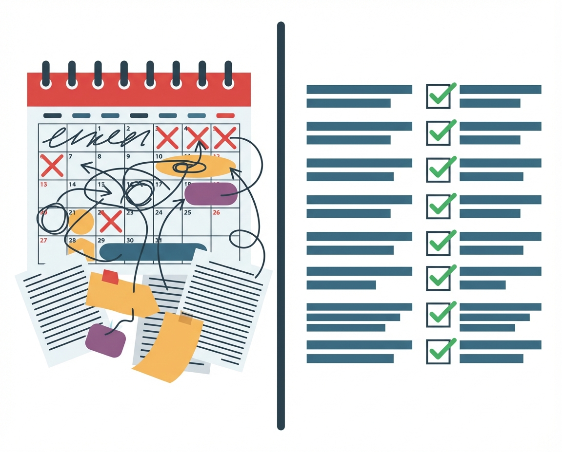
Often, the barrier is not the quality of your ideas or the willingness of your staff. The barrier is friction. If a member of your sales staff tries to open a training module on their phone between client meetings and the text is too small to read or the buttons are impossible to click, they will close the tab. They intend to come back to it later, but the moment passes. Responsive design is the technical answer to this very human problem of access and attention span.
Understanding Responsive Design
Responsive design is a development approach used to build web pages and eLearning courses that detect the visitor’s screen size and orientation and change the layout accordingly. The core concept is fluidity. Imagine water being poured into a cup, a bowl, or a tall vase. The water is the content. It does not change its substance, but it changes its shape to fit the container perfectly.
In a technical sense, responsive design uses a single code base. You do not have one version for desktops and a separate version for mobiles. Instead, the design uses flexible grids and layouts. Images resize automatically and text creates new line breaks to ensure it remains legible without requiring the user to zoom in or scroll horizontally.
- Fluid Grids: Elements are sized in relative units like percentages rather than absolute units like pixels.
- Flexible Images: Media renders within the containing element so it never extends beyond the screen width.
- Media Queries: The code asks the browser how wide the screen is and applies different styling rules based on the answer.
The Role of Responsive Design in Management
For a business owner, this concept moves beyond simple aesthetics. It is about respecting the time and context of your employees. When you utilize responsive design in your internal communications and training, you acknowledge that work does not always happen at a desk.
Your team might be reviewing safety protocols on a tablet while on a job site. They might be reading a policy update on their phone during a commute. If the content is responsive, you remove the technical hurdles that prevent learning. You are providing a consistent experience that signals professionalism and preparedness. It tells your team that you value their experience enough to make it seamless.
Responsive Design vs. Adaptive Design
When discussing mobile optimization with vendors or designers, you may hear the term adaptive design. It is helpful to understand the distinction so you can make the right choice for your budget and needs.
Adaptive design is static. It detects the device type and delivers a pre-made layout specifically for that device. It is like having three different buckets of water rather than one fluid stream. The server says, “This is an iPhone,” and serves the iPhone layout.
- Responsive: Easier to maintain because there is only one version of the content. It is generally more future proof as new devices with odd screen sizes are released.
- Adaptive: Can sometimes offer a faster load time or a more tailored experience for a specific device, but requires more resources to build and update.
For most businesses building internal training and knowledge bases, responsive design offers the best balance of cost, maintenance, and user experience.
Scenarios for Responsive Implementation
There are specific times when ensuring your content is responsive is critical to the success of your business initiatives.
Compliance Training When training is mandatory, friction leads to resentment. If an employee must complete a sexual harassment course or data security module, allow them to do it on the device they are most comfortable with. This increases completion rates and reduces the nagging required by management.
Performance Support This refers to resources employees need in the moment of need. A checklist for closing the store or a guide for troubleshooting a piece of machinery needs to be accessible on a mobile device immediately. Responsive design ensures these tools are readable when the pressure is on.
Onboarding Remote Staff New hires often feel disconnected. If their first interaction with your company handbook requires them to be tethered to a laptop, it can feel restrictive. Responsive onboarding materials allow them to explore company culture in a more relaxed setting, perhaps on a tablet while sitting on their couch.
Questions We Must Still Ask
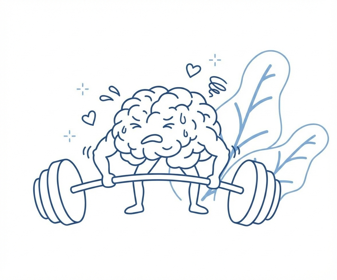
While responsive design solves the technical issue of display, it opens up questions about learning efficacy that we must still navigate. Just because content fits on a phone screen does not mean it is pedagogically sound to consume it there.
We need to consider if complex topics require the focus of a desktop environment. Does the ability to train anywhere lead to employees feeling they must train everywhere, encroaching on their personal downtime? As you implement these tools, observe your team. Are they retaining information as well when they consume it on mobile? We have the technology to deliver content everywhere, but the judgment on when it is appropriate remains a human responsibility.