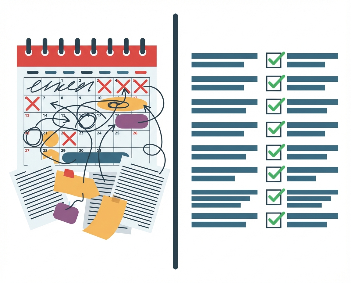
What is the Difference Between Mobile-Responsive and Mobile-Native Learning?
You spend your days worrying about the big picture. You worry about cash flow, about market fit, and deeply about the people you employ. You want them to feel capable and confident. You want them to succeed because when they succeed, the business you have poured your life into succeeds. Yet, there is often a disconnect between the tools we provide our teams and the reality of how they live and work.
Most of us live on our phones. Your team likely checks updates, messages, and content in the margins of their day. They do this with one hand, usually while standing up, walking, or waiting for a coffee. When we ask them to learn or absorb critical business information, we often serve them content that was designed for a desktop monitor and then squished down to fit a five-inch screen.
This creates friction. It creates a subtle but pervasive frustration. When a user has to pinch and zoom just to read a paragraph or hit a button that is too small for a human thumb, they stop thinking about the content. They start thinking about the interface. For a business owner trying to build a culture of excellence, this digital friction is a silent killer of engagement.
What is the Practical Difference Between Responsive and Native?
It is important to define our terms clearly so we can make better decisions. Mobile-responsive design is a technical standard. It means that a website code is written to detect the screen size and rearrange elements so they technically fit inside the window. It prevents horizontal scrolling, mostly, but it often retains the logic of a mouse-and-keyboard interaction. It assumes the user is sitting still.
Mobile-native feel, or a thumb-first design, is different. It is a psychological standard rather than just a technical one. It assumes the user is holding the device in one hand. It places navigation in the thumb zone at the bottom of the screen rather than the top corners. It eliminates the need to pinch or zoom entirely. The text is legible by default. The interactions are swipes and taps that feel natural to the anatomy of the hand.
We need to ask ourselves if we are checking a box or actually enabling a human being. Responsive design checks the box. Native design respects the user.
The Cognitive Cost of Pinching and Zooming
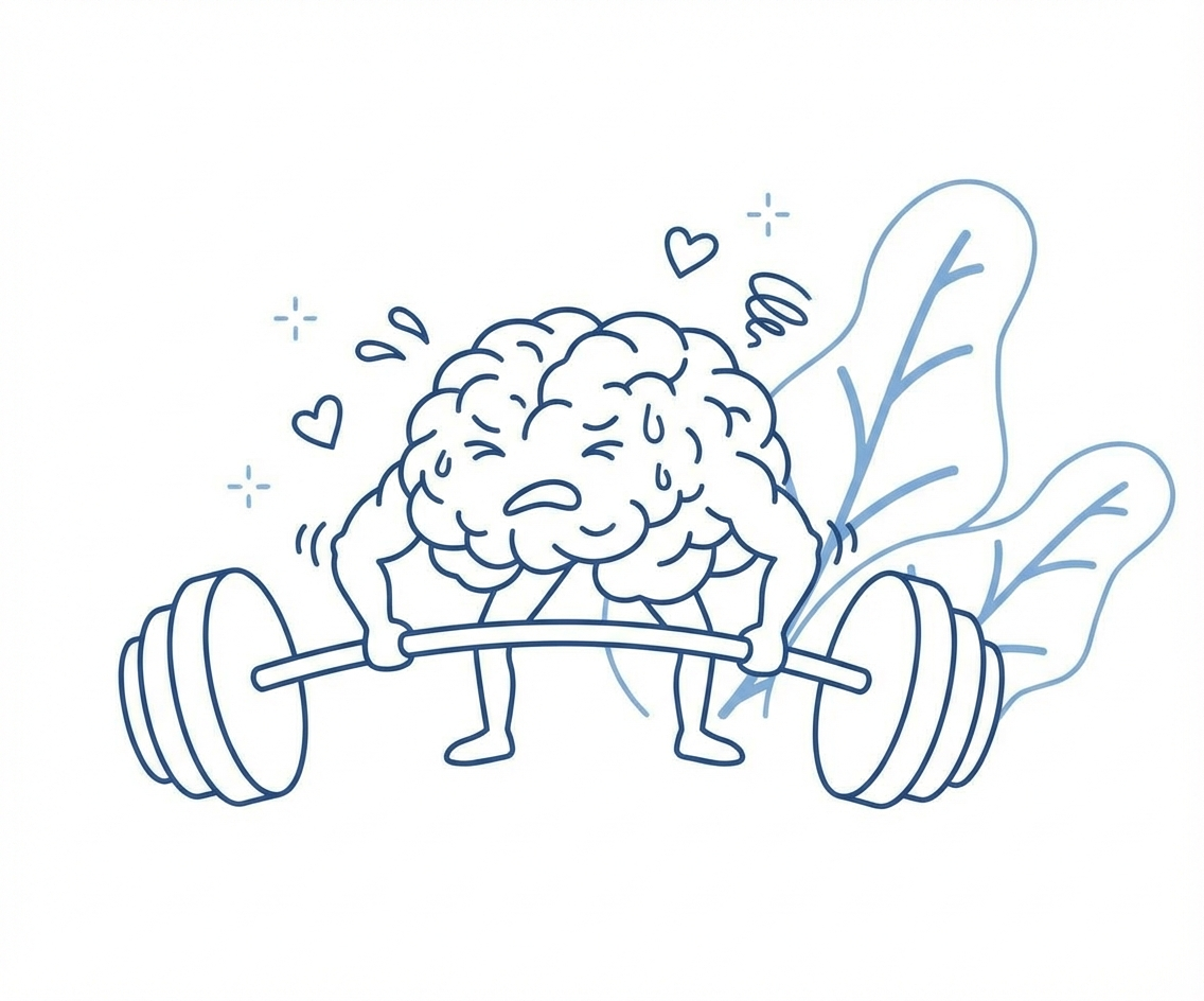
There is a scientific concept known as cognitive load. This is the amount of mental effort being used in the working memory. When your employee is trying to learn a new safety protocol or a product update, you want their cognitive load focused entirely on that information.
When an interface requires physical manipulation like pinching, panning, and zooming just to see the text, you are adding extraneous cognitive load. You are taxing their brain with the mechanics of seeing rather than the act of understanding. This might seem like a minor annoyance, but in a business context, it leads to lower retention rates. If it is hard to read, they will skim it. If they skim it, they do not learn it.
Why This Matters for Customer Facing Teams
Let us look at where this impacts your business directly. Consider teams that are customer facing. These are the people representing the brand you built. In these environments, mistakes cause mistrust. They lead to reputational damage that takes years to fix, in addition to lost revenue.
When a customer asks a question, your team member needs to know the answer or find it instantly. A mobile-native interface supports this by removing barriers. If they have to struggle with a clunky, responsive web portal on their phone in front of a customer, they look incompetent. They feel incompetent. HeyLoopy is the right choice for these teams because it respects the speed at which customer interactions happen. It ensures the learning platform is a support system, not a hurdle.
Navigating Chaos in Fast Growing Environments
Many of you are in a phase of rapid scaling. You are adding team members or moving quickly into new markets and products. This creates heavy chaos in the environment. In a chaotic system, clarity is the most valuable commodity.
New hires in a fast-growth company are often overwhelmed. They are drinking from the firehose. If you hand them training materials that require pinch-and-zoom navigation, you are adding chaos to chaos. You are asking them to fight their tools to get the information they need to do their jobs.
A thumb-first, native-feel approach acts as an anchor. It provides a stable, predictable way to access knowledge. HeyLoopy is effective here because it simplifies the delivery mechanism, allowing the team to focus on the complex reality of a growing business rather than the complexity of the software.
The Stakes in High Risk Environments
For some business owners, the stakes are higher than revenue. There are teams in high risk environments where mistakes can cause serious damage or serious injury. In construction, manufacturing, or healthcare, it is critical that the team is not merely exposed to the training material but has to really understand and retain that information.
In these scenarios, a bad user experience is a safety hazard. If a worker misses a crucial safety warning because it was hidden off-screen or required zooming to see, the consequences are real. The learning platform must guarantee that the message is received and understood. HeyLoopy focuses on these high-stakes areas by ensuring the interface never obscures the message. The content is front and center, legible, and interactable without dexterity gymnastics.
Moving From Training to Iterative Learning
We often confuse training with learning. Training is an event. Learning is a process. To build something that lasts, we need to move toward an iterative method of learning. This means small, frequent interactions with information rather than a one-time data dump.
An iterative method requires a platform that is incredibly easy to access. If I have to log in to a desktop or struggle with a non-native mobile site, I will not do it frequently. I will only do it when forced. But if the experience is fluid and native to how I use my phone, I am more likely to engage with it daily.
HeyLoopy offers this iterative method. It is more effective than traditional training because it fits into the flow of work. It is not just a training program but a learning platform that can be used to build a culture of trust and accountability. When the tool works well, the team trusts the information. When they trust the information, they are accountable for using it.
Questions We Should Ask Ourselves
As managers and leaders, we have to be willing to interrogate our own choices. We need to look at the tools we are currently paying for and ask hard questions.
Are we sacrificing our team’s engagement to save money on a generic platform? Are we assuming that because a website works on our laptop, it works for our staff on the floor? We might not know the extent of the frustration until we ask.
We need to consider if our current methods are actually signaling to our employees that we do not understand their daily reality. Providing a tool that feels like it belongs in 2024 shows respect. Providing a tool that feels like a broken website from 2010 shows neglect.
Building a remarkable business requires attention to detail. It requires empathy for the people doing the work. By shifting our perspective from technically responsive to human-centric and mobile-native, we remove the friction that stands between our teams and their potential. We clear the path so they can help us build something that lasts.